2025 – Now
Vertice
About
Vertice helps companies buy and renew their software without overpaying, and saves them millions doing it. It is where procurement teams track what they own, benchmark what they should be paying, and request what they need next. When I joined it was built around its own data model rather than the people running deals through it, so getting anything done meant thinking like the database instead of like a buyer. I own the experience end to end, research through to development, from someone’s first minutes in the product to an approval that satisfies compliance.
Two groups meet in procurement and want opposite things. A procurement manager lives in the platform every day and wants depth: filters, history, leverage in a negotiation. Everyone else, the engineer who needs one tool approved, the manager signing off the spend, passes through twice a year and wants out fast. Design for one and you lose the other. The job was knowing, screen by screen, which of the two I was serving.
Outcomes
The rigidity was never local to one screen, so the work runs across the platform. Fix onboarding without fixing requests and the drop-off just moves; fix requests without fixing approvals and compliance sits exactly where it started. The redesign had to move end to end, in the order a person meets the product.
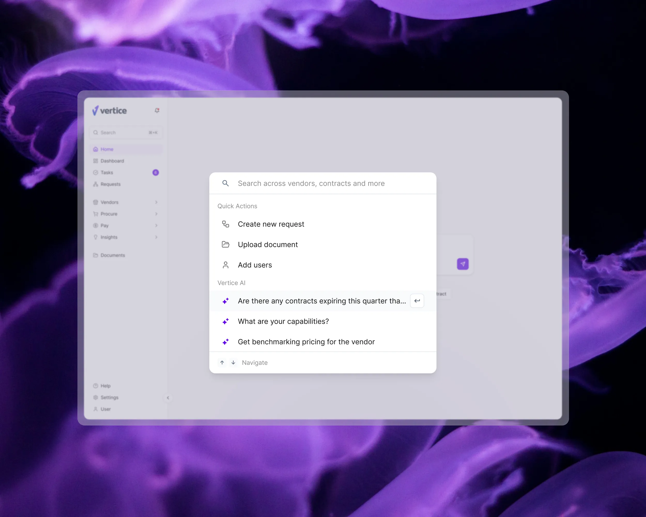
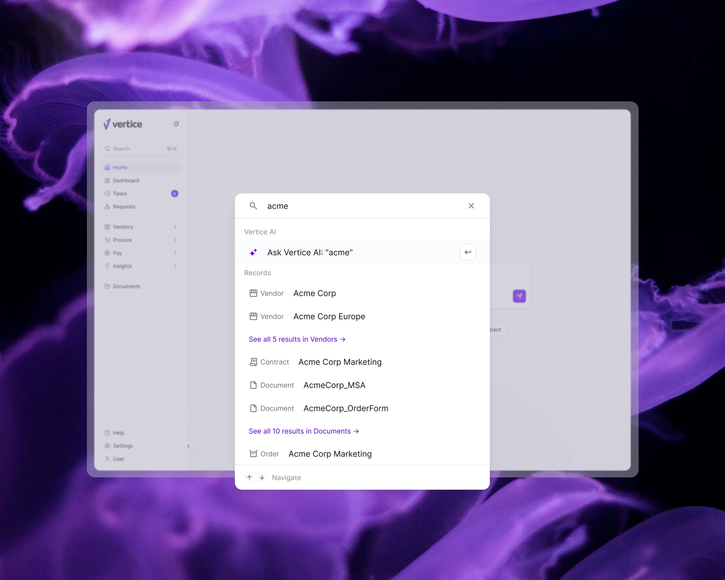
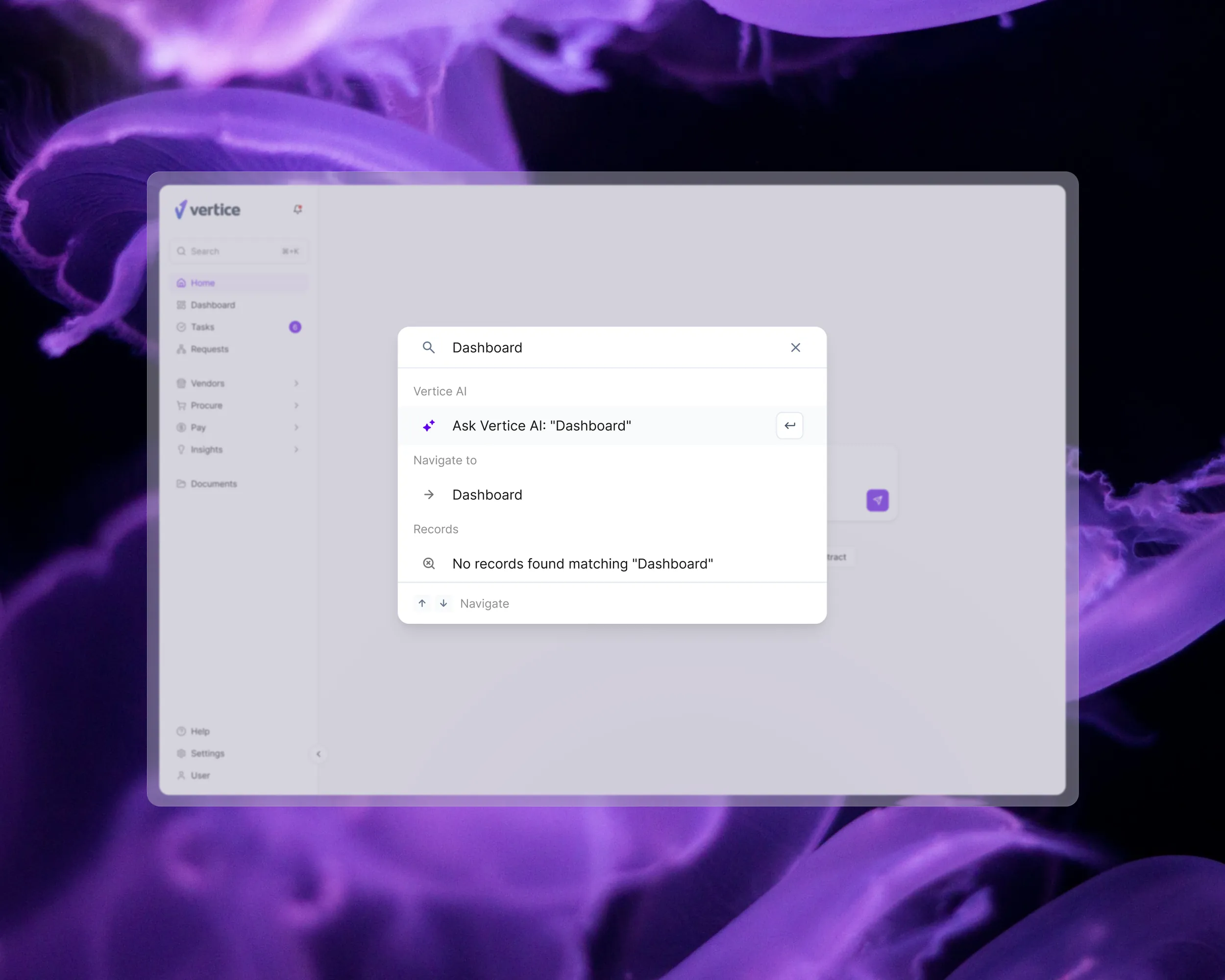
It starts at first time onboarding: a new procurement manager gets to a working sense of the product in minutes, not a training session. From there, a global search reaches vendors, contracts and pages from a single field, so people stop hunting through a nested menu for something they could simply type. It is the change the research called for most clearly.
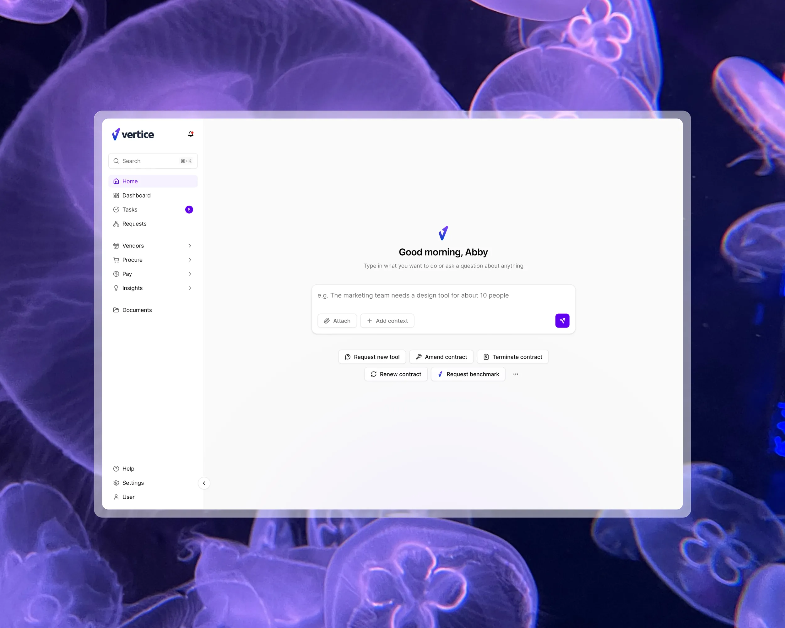
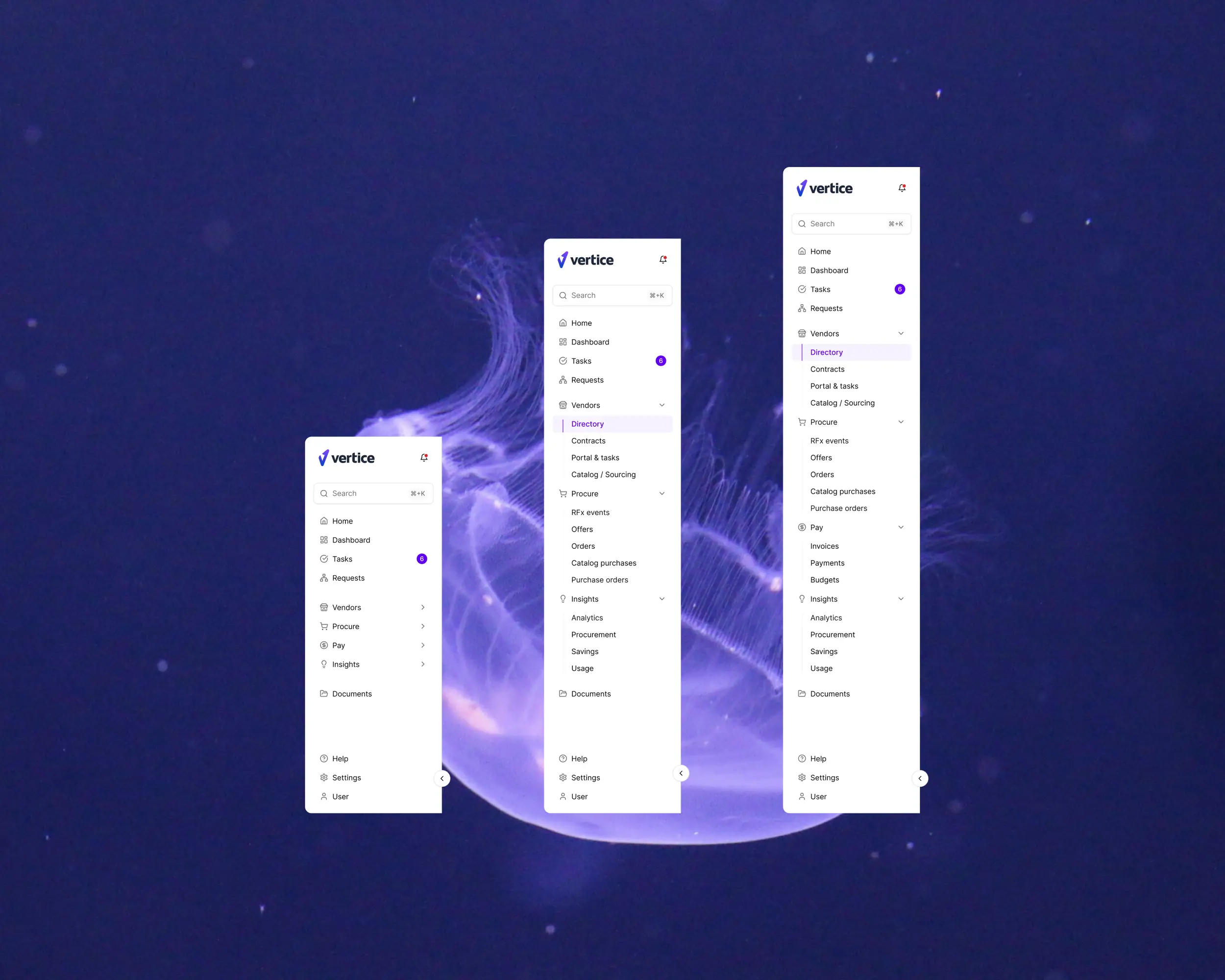
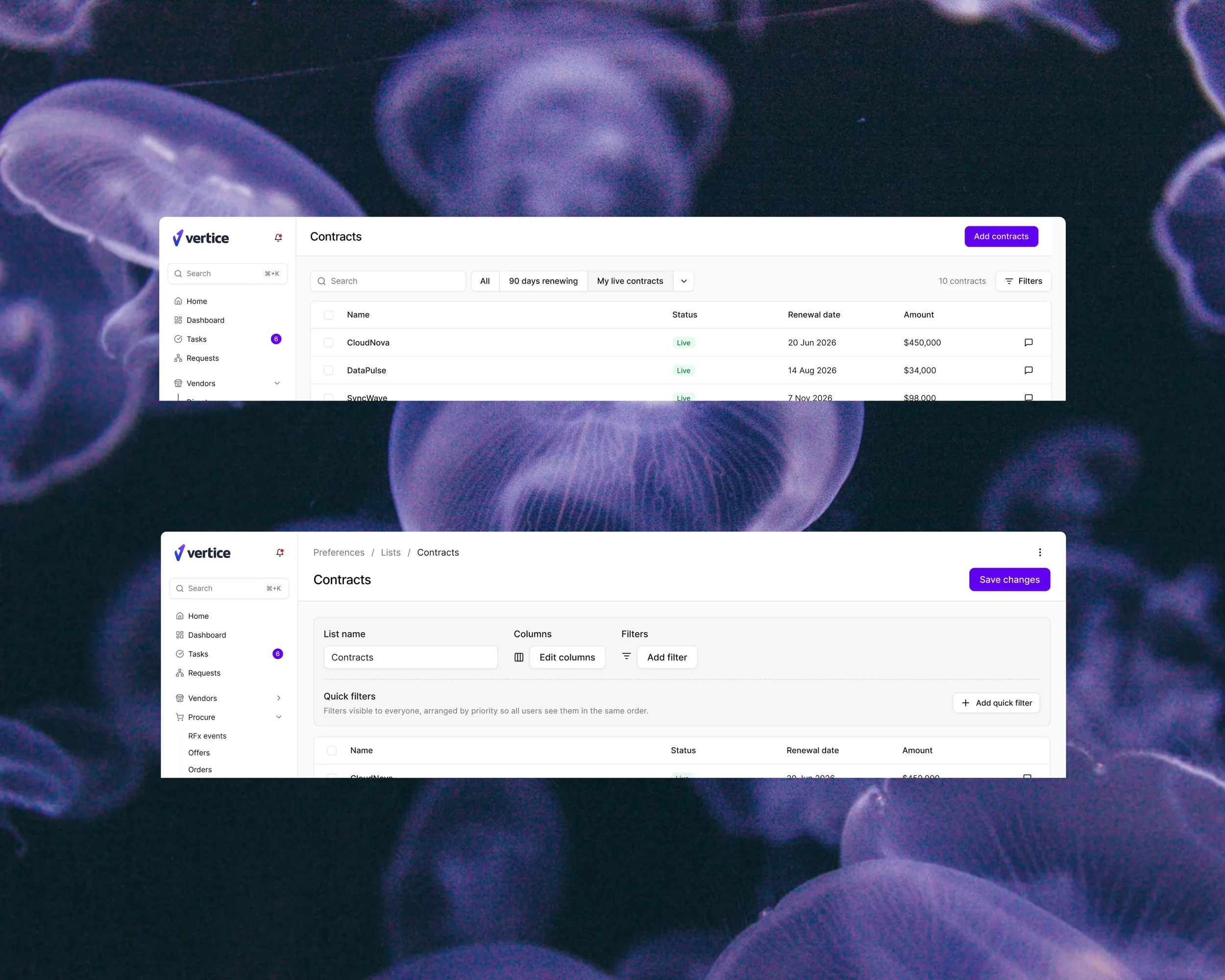
Then the request page, the heart of the product and the one with the worst reputation inside it. I rebuilt it around what people are trying to achieve, a new vendor, a renewal, a benchmark, rather than the objects sitting behind it. That pointed to a flexible requisition model: start from a business need, a category or an employee request and take whichever route fits, instead of one path that assumes you already know what you want. Negotiation went into the work rather than beside it, a live summary of where an offer stands sitting next to the offer. And approvals now bend to the shape of each company, instead of forcing every one of them through the same chain.
Onboarding and search are live. The request, negotiation and approvals work is rolling out in stages, which is the honest shape of rebuilding a platform people are using the whole time: not one launch, but a steady replacement of the parts they touch most.
Problem
The platform described its own data model, not the way procurement works, so a screen would ask for a contract ID before it asked what you were trying to do. People worked around the product rather than through it: side spreadsheets, Slack threads, whatever closed the deal faster than the tool in front of them. Adoption struggled, which is the plainest signal that something was built from the inside out.
It was also a moving target. Engineering was rebuilding the system underneath at speed, and building it well, but design had to land inside constraints still being set as we went. At its widest the work spanned 80 engineers, shipping faster than one designer could review, so part of the job turned protective: catching AI generated screens that went out ahead of a design pass and pulling them back into line.
Research
None of that started as a hunch. Three sources, each answering what the others could not.
PostHog showed what people actually did. They dug through nested menus for things they already knew the name of, and abandoned the attempt more often than they should have. The fix was not a better menu, it was removing the need for one.
Interviews with procurement managers, inside the company and outside it, told me why. Analytics gives you the drop-off point; only a conversation tells you whether that is confusion, distrust or a genuinely missing feature. Those gave me the confidence to make quick calls on a moving deadline and defend them.
AI prototyping closed the last gap. For the negotiation agent I put something working in front of people early, so we reacted to how it felt to use rather than to how it read in a review. It changed real decisions: what the AI says and when, and how much control it hands back to the negotiator.
Learnings
Across the rebuild so far, four things have held up.
Flexibility beats rigidity, and it is worth the extra work. A rigid flow is easy to specify, build and defend to compliance, but people do not move in straight lines. The flexible version improved the experience tenfold and, against expectation, made the process easier to track rather than harder.
Designing with AI demands a sharper brief. A prototype comes back in minutes, but only ever as good as the definition it was given, so the thinking has to happen first.
In procurement, permissions are the work, not the edge cases. The data is sensitive enough that a wrong one is not a rough edge to tidy up later, it is the whole problem.
And stay close to engineering. With more product being built than one designer can cover, the most useful thing I do is give direction early rather than review what ships. Which is the same lesson as the rest of this project in a different form: by the time you are looking at the screen, the model underneath it has already been decided.